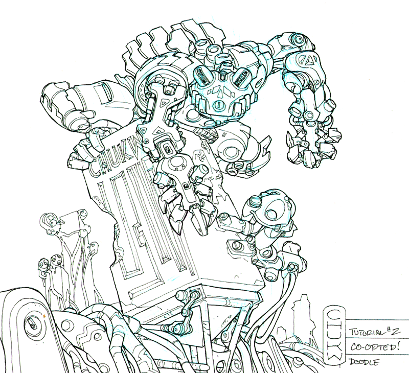
| I've
taken a .01 Pigma Micron and beefed up the inks. The goal to to make the
forms "pop", that is, to stand out in a semblance of three- dimensional
shapes. My philosophy is pretty simple- Wherever there would "air"
between two masses, the outline of the foremost mass gets a heavier outline-
a boundary line. The general outlines, needless to say,
get a boundary line as well. Compare this stage to the previous, and you'll
see it looks much less "flat" and reads much more easily. |
|
The
lighter lines that don't get this treatment are basically textures, adding
detail to the forms, like the panel lines on the frog's nose or that crunchy
pattern on the branching alien tubules. The more distant an object is, the
less beef it gets, like those distant towers. It's a simple form of atmospheric
perspective. Some folks will work in the boundary lines in at the beginning
of the inking process, but I like to do it this way because it really makes
me think about the volume of the forms. |
|
By the way, When
two forms blend into one another, you've got to feather the stronger line
down to a fineer one at that juncture. Furthermore, if you have a strong
light source in mind, the boundary lines are even heavier in the area
that will be in shadow. It's really pretty simple when you sit down and
do it- I probably yap too much!
Note:
I used a different scanner to import the drawing at this stage, and the
blue lines didn't show up too well. They're still there- for now!
|
|
 |
|
 |
|
 |
|
 |
|